
Project Overview
*This is an ongoing project which will continue to be updated as each phase is completed*
Literacy Volunteers on the Green (LVG) is a non-profit organization based in Connecticut. Their mission is to help adults maintain and improve their quality of life through mastery of the English language.
Founded in 2005, the organization now has 90 trained volunteer tutors and 150 students and is governed by a 13 member board of directors. It is a ProLiteracy America affiliate and a United Way Partner Agency. LVG offers free courses on topics including U.S. citizenship exam preparation, ESL, workplace literacy and much more.
For this project, I was contacted by the Board of Directors to help plan out and design a new website for the organization.
There were a few big goals for this projects, which included:
Giving the website an updated and fresh design
Effectively communicating the services that the organization offers, with a focus on story-telling
Promoting donations and improving the online donation experience
Improving website accessibility for the organization’s many ESL students
Throughout this project, I would work closely with a member of the Board of Directors, as well as having key deliverables reviewed with the executive director of the organization and other board members.
Research
I had 3 primary research goals:
Gain an understanding of the big and small picture goals of this specific organization
Gain better knowledge of literacy volunteer organizations
Become familiar with non-profit websites and how they are structured and operate
METHODSPrimary/Market Research
Competitive Analysis
1-on-1 Interview
FINDINGS
I assessed a number of other literacy volunteer organizations, both in other counties in CT and around the U.S. The best features I discovered among these websites included:
Imagery and messages geared towards 3 population groups: students, volunteers and donors
Clear call-to-actions on each page
Prominent buttons to donate distributed in a variety of places
Menu navigation spanning across the header for easy-to-find access
Trend of “student stories” featured on many internal pages to increase organization affinity
Translate page function
Simple instructions and process for student and volunteer registration
I also was able to have a detailed conversation with the primary stakeholder (Board member) and get a more specific understanding of their organization structure, the population they serve, and how they operate. This interview was critical to figure out what was critical to the organization for this project, what features were “must haves” and what would be “nice to have.”
Based on the research findings, I decided that the LVG website should include:
Information Architecture & Interaction Design
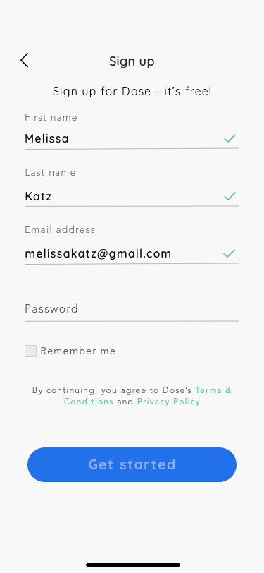
During this phase of the project, I created a user persona that represented many of the people who participated in the anonymous survey, who find that keeping track of their health conditions and medications can be a burden that gets in the way of their life. The survey research found that when people were asked how important they believe it is for people to maintain excellent adherence to taking their prescription medications on a scale of 1-5, the average response was 5. The user I created, Melissa, reflects that value of prioritizing her health so she can continue going about her life.
I also created a Dose sitemap and task flow during this phase, to help chart out the hierarchy and structure of the app, and to build out the intended flow of a typical Dose user. The functions and behaviors determined during this phase were brought to life in the interactive prototype.
Low & Mid Fidelity Wireframes
Based on the findings and structure determined in the previous stages, I sketched out the screens for all of the anticipated user flows. I knew that the app had to be “familiar” to users and feel like apps they are used to interacting with.


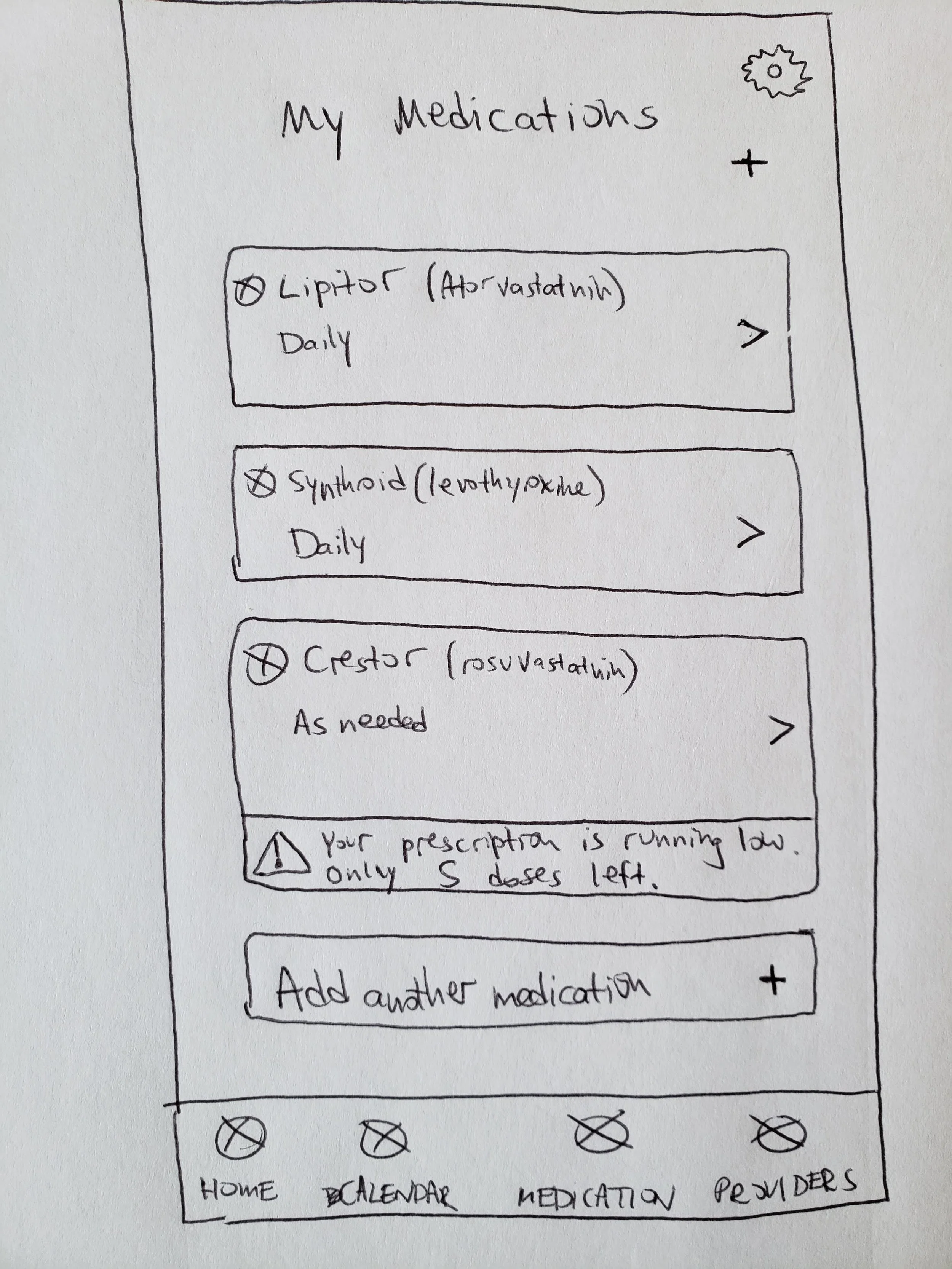


In between the sketching and digitizing the designs in Sketch, I was able to refine some of the flows and make other design decisions for the mid-fidelity screens shown below.


After completing the low and mid-fidelity designs, besides for adding in more definition and UI, there were a few key takeaways to incorporate into the final designs based on feedback:
Redo sign up/log in concept
Remove weekly counter in Home Dashboard
Consider ways for users to add in a one-time (quick add) medication like Advil
Give users a way to edit their reminder settings for a dose
Make additional medication details expandable
Branding and UI
I researched other health care related apps to understand what the best design style would be for Dose. I wanted the UI to be incredibly easy to understand and navigate, I wanted the text and colors to be clear and accessible for people of all ages, and I wanted to use designs that make medication management feel simple, manageable, and positive. I chose to use isometric style icons because of their particularly clean and somewhat realistic look.
With all this in mind, I built a UI kit that included icons, a logo, buttons, colors and typography.
Hi-Fidelity Wireframes and Prototype
I added the UI into the designs, and further refined the designs of some key screens to improve usability and eliminate anything that was not absolutely necessary or useful for users. This included simplifying the top of the Home page, incorporating a “check” feature into all forms, and refining the way users can set and edit reminders for their medications.
View all of the final designs and how they interact in the full prototype below.


Next Steps
I conducted usability testing of the app prototype with 2 participants. Based on their behaviors and verbal feedback, I planned the next steps to improve the usability and overall experience of the app. This includes:
Sync Tracker to iCal or Google Calendar
Build a way for users to request prescription refills
When adding a new Quick-Add medication, default time in picker should be current time
Way to upload image of each pill or search image from database
Google Maps integration to Provider details
Reconsider just using 2 colors in Tracker (for Complete and Incomplete)
View other projects
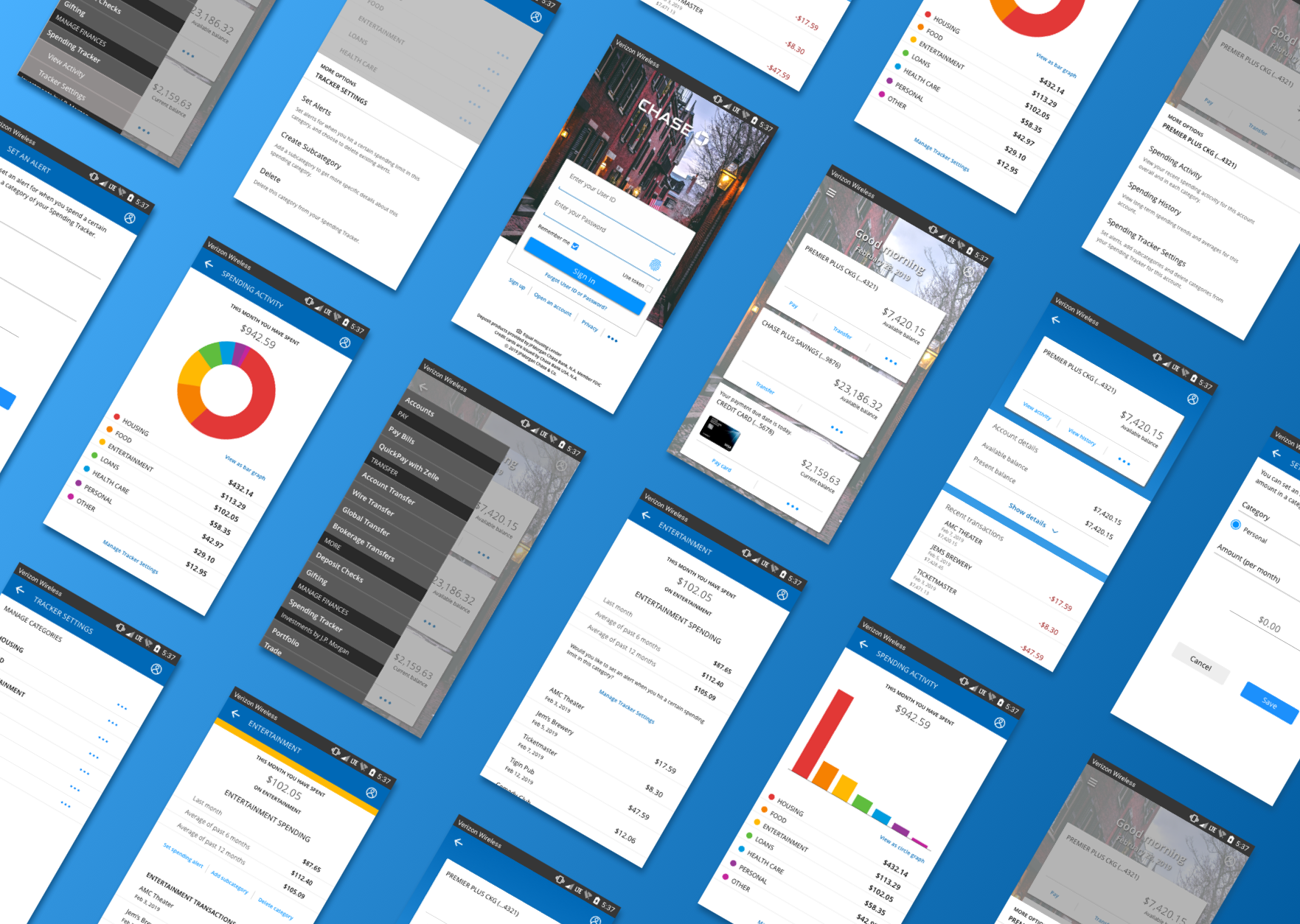
Chase Bank
A financial management tool for an existing mobile app
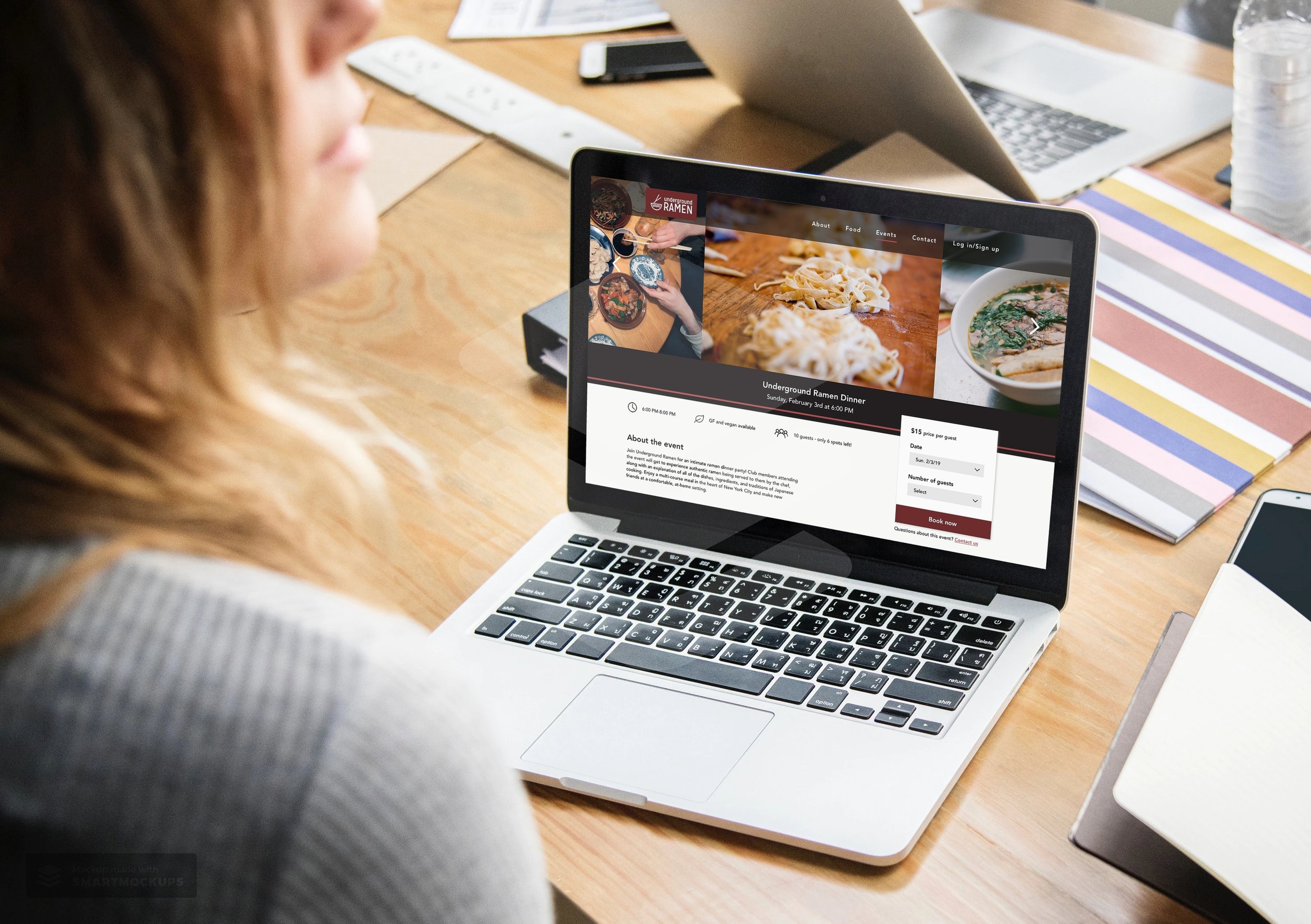
Underground Ramen
A responsive website for an underground dining club